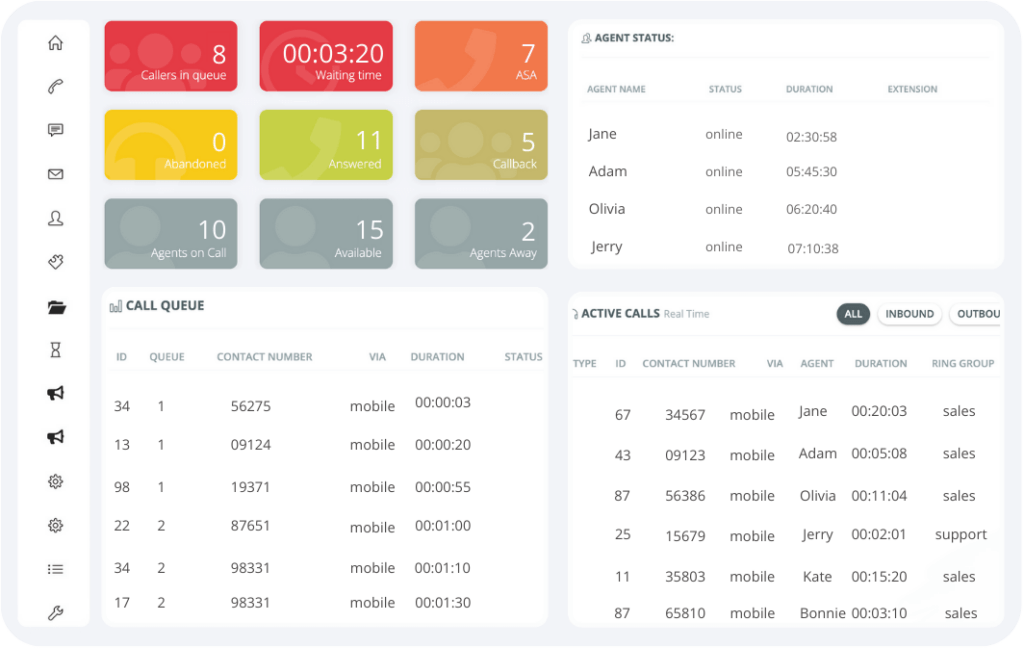
Contact Center Overview Dashboard
- Real time view to your contact center performance
- SLA and other important metrics on a single screen
- Listen to live calls right from the main dashboard
Here’s How Contact Center Overview Dashboard Works
It is very crucial to record and surveil the accomplishment rates of your call center since the quality of work affects the influx of sales and profit. In order to keep track of business, a highly effective organizer is a business dashboard. For a call center company, a performance dashboard can easily be designed using MS Excel.
In order to monitor the company’s service quality, we need certain criteria to judge the work efforts on, and these indicators are incorporated with the call center dashboard from the Nectar Desk call center KPI dashboard. The main KPI for surveilling performance include:
- Response time: Usually conveyed in seconds from the time the call is started till it is answered by an agent, it measures the efficiency of the center’s workers.
- Rate of abandoned calls: This is the scale of the magnitude of calls that are cut before they are connected with an agent who responds. It is calculated by [amount of cutoff calls during waiting period] / [total incoming phone calls].
- Issue resolution rate: A major dimension that is displayed in % form, the First Call Resolution value enumerates the number of issues that will be completely resolved by the first calling.
The call center KPI dashboards are used to keep a record of service quality levels for whatever length of time you wish. Results can be generated on a weekly, monthly, or multiple-monthly basis.
Monitor contact center operations in real-time.
Provide insight into agent performance metrics.
Have an access relevant information and metrics.
Identify and address issues before they escalate.
Provide efficient long-term strategic planning.
Manage your call center KPI easily and effectively.
How to Construct Your Call Center Dashboard
The easy and structured Excel model for business dashboard has three sections: the primary dashboard sheet, the input data, and the computation part. Use these steps to set up your own organized record of performance:
- Calculate the KPI based on a chosen and fixed time period (start date to end date) and to locate the values from the datasheet, you use VLOOKUP.
- You can enhance visual presentation by using Excel Icon tools and inserting them into your dashboard or by inserting a picture of your own choice.
- To display data in different formats you use the spin button form control and can select form from a range of unique charts and graphs.
Powerful alone,
but even better with:


